Architecture lettering or font is meant to be practiced in professional usage by Architects. This was a mandatory course in Architecture education. Presently, it is not so in some institutions whereas in some universities it remains a mandatory subject or part of the curriculum.

Students or Professionals who question why would I have to go through this, who and since when people started doing this, why should I change my lettering or handwriting, I am no longer drafting, it is all digitalised, WHY EVEN NOW?
Answers to all your questions are here.
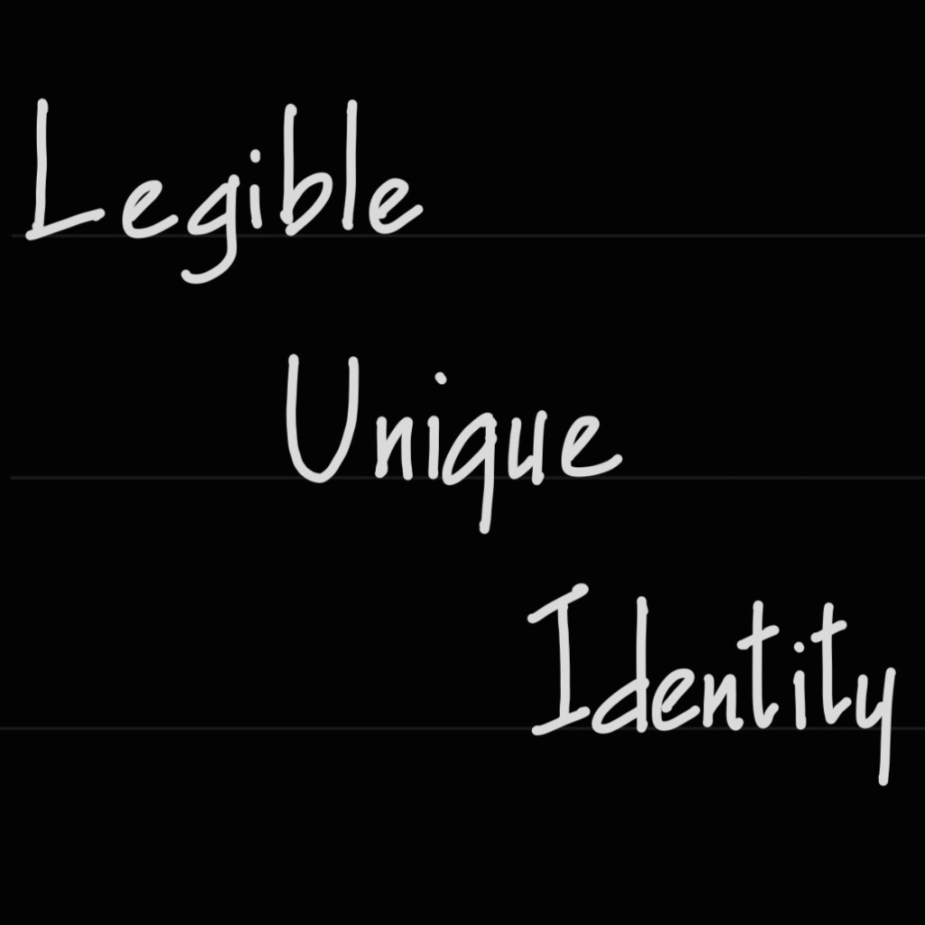
We live in a digital era with fast-paced work nature using technological advancements. Changing color schemes or designs or materials will take you time to accomplish with desired results. Even then it’s way quicker than early days. In the early days of Architecture, without digital tools and technologies, one had to make drawing sheets manually. Making or composing sheets is not only about drafting drawings but also dimensioning and adding sheet template, title, and narrative. When it comes to writing, in addition to the usual writing factor as legibility, one other factor was crucial. Uniformity. Sometimes multiple people work as a team on the same blueprint (similar to present day IFC in BIM).

Imagine each one’s different handwriting on a single sheet.
One could be small, big, legible or unclear. In order to have a clear understanding of the text, architectural fonts were used. Even though it was an age old practice, I would vote for Francis D.K. Ching for his contribution towards architecture fonts or lettering. Because his handwritten notes and his books Architecture Graphics and Form, Space and Order published in 1975 in architecture lettering are the biggest influence even today. Every student for sure relies on at least one of his many books.

Recent editions of digital prints have an architecture font called Tekton which is entirely developed from Ching’s handwritten architecture lettering.
Image showing a page in Ching’s book
So, you could also say “we have digital architecture fonts too, why waste time in practicing this lettering?” We use digital tools and technology advancements. Still, when we explain to clients or want to make a simple sketch and add title or specifications, are we gonna rush to get a digital tool?
I would like to remind you of one thing which one of my professors insists and I agree with. “Mouse (or Apple Pencil or digital pens) can’t do what our hand and brain can do together”
Writing or scribbling manually captivates your brain to concentrate and improves your memory, critical thinking. I don’t think practising architectural font will be a waste of time. It will pay you off with
and a gentle reminder of relying on your hands more.


Leave a comment